
Style for the Dark Side—or the Light Side? (help!)
This Star Wars webcomic of mine (from a comic I drew as a kid) kind of disgraces me as a designer! But it’s such a hard style to get right, for the particular, unusual content which it carries. I’d love to get your input.

Turn to the Darkside — or — the Lightside?
Ordinarily, I prefer not to ask people for their opinions on my work, but I’m just too close to this thing and… it’s also complicated.
The webcomic is built around a comic book adaption that I did as a kid between early 1978 and about 1983. So between the ages of 9 and about 14 or 15 years old.
The current look is my CSS-tweaked version of a very plain and basic off-the-shelf Comic Press skeleton template. It’s difficult to get much more creative with it in terms of layout etc., so what I’ve done is mainly adjust the typography, colours and forms of the various widgets and content boxes, like rounding off their corners.
The Design Problem to be Solved
The problems as I see them from a webdesign point of view are mainly all about the fact that what’s being displayed/presented/exhibited in the website is pretty rough looking, at times very tatty, stained, and even partially eaten by Silverfish insects! The paper is nearly 4 decades old. But most of the drawings lack finesse. What this means is that:
- A ‘clean’ minimalist gallery-style website isn’t really going to fit the tatty looking content. It’ll make the content look even tattier by contrast.
- When I do a slightly tatty looking site design (like my other alienage11.com webcomic) it just makes everything look like crap 😀
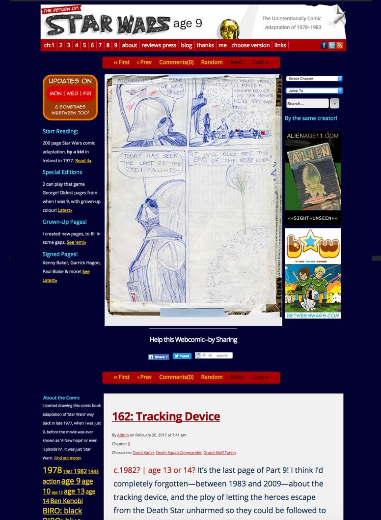
My feelings about the current Dark version
Although it looks dated, like a website from over 10 years ago, the darkness of it:
- Gives a an outer-spacey look
- Makes the comic pages themselves pop out
- Makes the site sort of envelop you more, like something you go inside (I think)
- looks amateur and a bit porny
My feelings about an alternative White/Light version
- It’s more modern and neat and less cluttered looking
- Does not give a an outer-spacey look
- The site envelops you less
- It’s freshness and modernity might make the comic pages look even crappier by contrast
- It doesn’t look very Star Warsy
So what do YOU think?
Which would you prefer of these 2? The White/Light version is still rough and individual elements still need finessing.
Please let me know in the comments section below the following images


2 More Variants:
And… Just to confuse you even more, here’s 2 dark versions with some of the box backgrounds removed, from along each side. It’s less structured looking now, but less clunky and heavy.
I actually think the last/2nd one with the dark grey page background might work well. It’s less overpowering than the navy, and lets the comic page pop a bit more.
No obvious ‘boxes’ down either side of the comic now.

Dark grey page background is less overpowering than the navy version and lets the comic page ‘pop’ more. Grey is neutral
So: which do you prefer? Please let me know in the comments section below

The dark side looks better on my phone. There’s a clear distinction between the frame and the comic.
LikeLike
Hi Rob.
(Rob P?) Thanks for the feedback! Do you mean the 2nd image down? That’s what’s in place on the live site at present.
What do you think of the other dark one (the very bottom/last one), with the dark grey background, and no boxes around the left and right modules?
😉
John
LikeLike
I like the dark ones, either the navy or grey. The grey might be more sophisticated looking than the navy.
LikeLike